type: widget
release: 1.5
status: released
documentation: http://api.jqueryui.com/slider/
demo: http://jqueryui.com/slider/
1 - Description:
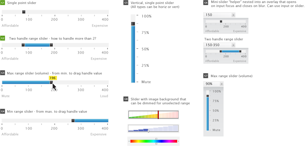
A slider allows a user choose from a continuous range of allowable values presented in a visual continuum. The simplest slider (G1) allows for a single point to be selected. A range of values can be selected by providing two sliders (G2) or having a combination of a slider with a fixed maximum (G3) or minimum (G4) value. Each of these slider types can also be presented hortzintally (G1-4) or vertically (G5). These should be able to be embedded into a page (G1-5, G8) or inserted into menus as small UI 'helpers' for form inputs or embedded controls (G6-7).
In the standard ThemeRoller slider, there is unfilled "track", one or two square sliders and a filled line that connects multiple sliders. We should provide a means to use the slider with a custom background image (G8).
Sliders should be able to be created by progressive enhancement techniques by scraping the values from a set of radio buttons, select options, unordered list or other html structures. The html > data utility will be instrumental for this. For a detailed example of a PE slider with axis labels and tooltip features, see Filament Group's example:
http://www.filamentgroup.com/lab/progressive_enhancement_convert_select_box_to_accessible_jquery_ui_slider/
Configuration options should include:
- horizontal/vertical orientation
- slider size (h,w) - determined via css
- number of sliders (1,2,3+?)
- array of specific values or min/max/increment (ex. 500-25,000 with increments of 25)
- x axis labels: auto show as many as you can fit or accept an increment (every 3 ticks) plus show min/mid/max labels
- x axis grouping labels
- tooltip of current value never/always/onDrag
There is an existing jQuery UI slider but it only supports horizontal sliders. PE support, axis labels and groupings, drag tooltips and other important features need to be added.
http://docs.jquery.com/UI/Slider
2 - Visual Design:
3 - Functional Specifications/Requirements:
Options/Methods/Callbacks
One handle slider (default)
- options:
- animate (boolean, default: false)
[Todd] Is this used to animate the handle to the next step for keyboard input or to move the handle to the next availble step when the stops event is fired from a mouse event?
[Richard] This is used to animate every time the handle moves except when the user is moving it by dragging with the mouse.
- max (float, default: 100)
- min (float, default: 0)
- orientation ('horizontal', 'vertical', default: 'horizontal')
- range (true, 'max', 'min', default: false)
- step (float, default: 1)
- value (float, default: 0)
- values (array or floats, default: null)
- methods:
- callbacks:
- start (events: mousedown, keydown)
- slide (events: drag, key held down)
- stop (events: mouseup, keyup)
- change (events: mouseup, keyup, click, value option/method)
Specifications
- max, min, step, value should be get/set as integers/floats
- min must be less than max
- horizontal slider - min is at left, max is at right
- vertical slider - min is at bottom, max is at top
- value will always change by an increment of step, whether by keyboard or mouse
- keydown HOME on handle sets value to min
- keydown END on handle sets value to max
- keydown UP on handle increases value by step, not greater than max
- keydown RIGHT on handle increases value by step, not greater than max
- keydown DOWN on handle decreases value by step, not less than min
- keydown LEFT on handle decreases value by step, not less than min
- in the case of one handle, the slider min/max are min/max for the handle
- in the case of two handles, and range true, each handle's min/max is set by the current value of other handle. The first handle's min is the slider min. The last handle's max is the slider max
- if there are more than two handles, or range is false, the slider min/max are min/max for each handle
- range: true only works with two handles
- range: 'min' and range: 'max' only work with one handle
- value option/method: the value option is not restricted by min/max/step. What is returned by the value method is restricted by min (>=), max (<=), and step (even multiple)
- start callback: triggers when movement starts via mouse(mousedown) or keyboard(keydown). Not triggered by value option/method
- slide callback: triggers during movement via mouse(drag/mousemove) or keyboard(key held down). Not triggered by value option/method
- stop callback: triggers when movement stops via mouse(mouseup) or keyboard(keyup). Not triggered by value option/method
- change callback: triggers when the slider has stopped moving and has a new value (even if same as previous value), via mouse(mouseup) or keyboard(keyup) or value method/option
- mouse click (mousedown and mouseup without mousemove) triggers start, stop, change, but not slide
Changes from 1.5, 1.6rc2 in refactor
- 'axis' option was changed to 'orientation'
- 'handle' option removed
- 'handles' option removed
- 'steps'/'stepping' options removed in favor of 'step' option
if you want 5 evenly divided pieces, specify
min: 0, max: 5, step: 1
or
min: 0, max: 100, step: 20
-
'startValue' and 'moveTo' removed in favor of 'value' option and 'value' method
-
'round' option removed
-
'distance' option removed
-
'noKeyboard' option removed
-
multiple axis removed - too complex for 1.6, and doesn't make sense considering our upcoming full refactor of slider. May need to be a separate plugin
4 - Markup & Style:
4.4 Accessibility recommendation
See keyboard support discussion.
The slider requires the following ARIA attributes:
- role="slider"
- aria-valuenow="<numeric value>"
- aria-valuemin="<minimum value of the slider's range>"
- aria-valuemax="<maximum value of the slider's range>"
- Optional: aria-valuetext="<text version of the slider's value>", such as "20 dollar" or "100 MB"
For range sliders, one handle provides a boundary for the other handle (as range sliders handles can't pass each other). Because of this, changes to the first handle (representing the lower value of the range) need to trigger an update to the "aria-valuemin" value of the second handle (representing the upper value of the range. Similarly, changes to the second handle need to trigger an update to the "aria-valuemax" value of the first handle.
Each handle needs to have an accessible name. This name can be set using either:
- A "title" attribute on the actual handle.
- An "aria-label" attribtue on the handle (not supported by IE8).
- An "aria-labelledby" attribute on the handle, referencing the ID of an element containing the label text.
- A separate <label> element with a "for" attribute referencing the ID of the slider handler.
Note that only the last option is really useful for sighted keyboard users. For the other options, redundant visual text will have to be added for a sighted user to understand what the handle represents.
Regardless of how the accessible name is implemented, the developer needs to be able to specify it through widget parameters.
Handles are currently implemented as <a href="#">, which is less than semantic and triggers a statusbar change. This should be changed to <a tabindex=0> as soon as possible, probably in 1.9.0
5 - Latest version of plugin:
http://view.jqueryui.com/master/demos/slider/default.html
6 - Open issues being discussed
none
Comments (8)
RichCaloggero said
at 3:14 pm on Jan 13, 2009
This doesn't work at all.
On the "default" demo page, all I see is one object that is announced as a
link by the screen reader and has "#" as its anchor text. Clicking on it
does nothing.
I tried both Jaws (my default screen reader), and the open source NVDA
screen reader which boasts good ARIA support. Find their site at:
http://www.nvda-project.org/
Maybe jQuery-ui project aught to coloborate with these folks directly. If we
could get this stuff working in just one screen reader, then ARIA would have
a better chance getting the press / recognition it needs to succeed.
-- Rich
RichCaloggero said
at 3:29 pm on Jan 13, 2009
I just tried a simple test:
with a dummy slider control: just a div with role="slider".
For giggles, I included a button made from a span with an alert as onclick, and a heading made from a span with aria-level=2. Jaws correctly announced the heading and level, and it announced the button correctly and responded to the click by focusing on the alert dialog when it came up. When the dummy slider gains focus, Jaws announces it as a "trackbar".
This suggests that perhaps the aria on the slider page is not correct or missing?
-----
<body>
<h1>Roles</h1>
<div role="heading" aria-level="2">Role Tests</div>
<p>Here are some objects:<br/>
<span tabindex=0 role="button" onclick="alert('yikes'); return false">Click Me</span><br/>
<span tabindex=0 role="slider">Slide Me</span><br/>
</p>
</body>
-----
-- Rich
Scott González said
at 8:41 pm on Feb 16, 2009
Slider should be updated to be more consistent with HTML 5 input ranges (http://www.whatwg.org/specs/web-apps/current-work/multipage/forms.html#range-state)
hugh.lomas said
at 10:17 pm on Jul 2, 2009
Hey, I was working on an application for Facebook and adapted the slider to:
Accept only pre-determined non-linear intervals (i.e. 5,10,20,50,100, 500). This can be edited dynamically.
Provide visual feedback with tick-marks of valid values and min/max, and an output of the current value above it
You can view an example on the second screen of
http://apps.facebook.com/giftparty/hostparty.php
Yanick said
at 6:13 am on Jul 3, 2009
Having a transformation function is not necessarily useful in this context as the slider itselft does not display a tooltip of the currently selected value (or any textual representation of such value). Therefore, an implementation is superfluous. To achieve the same principle, any textual visual representation can pass through such transformation function when the "change" event gets fired. An example would be :
$(".selector").slider({ min:0, max:6, change: updateVisual});
var values = [5,10,20,50,100,500];
function updateVisual(e, ui) {
$(".label").text( values[ui.value]);
};
The last example virtually achives the exact same result without even touching the plugin source.
GreyCells said
at 8:50 am on Jan 19, 2010
A fairly common use case relating to range sliders: When two handles are specified, the div.ui-slider-range between them should be draggable.- so the start/end handles can be moved as a pair.
lidiexy said
at 3:55 am on Aug 3, 2011
In my opinion this is a good example.
http://blog.egorkhmelev.com/2010/03/jquery-slider-update/
David Petersen said
at 2:11 pm on Oct 16, 2012
Some interesting options for how to handle ranges and handle collisions:
http://www.infragistics.com/products/aspnet/sample/slider/configure-with-two-thumbs
You don't have permission to comment on this page.